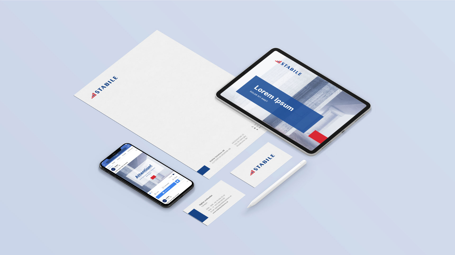
While renewing a visual identity for a client we usually face a challenge of how to keep the old identity coherent with the new one. So, this time it took us a while to find a sweet spot between the old and new faces.
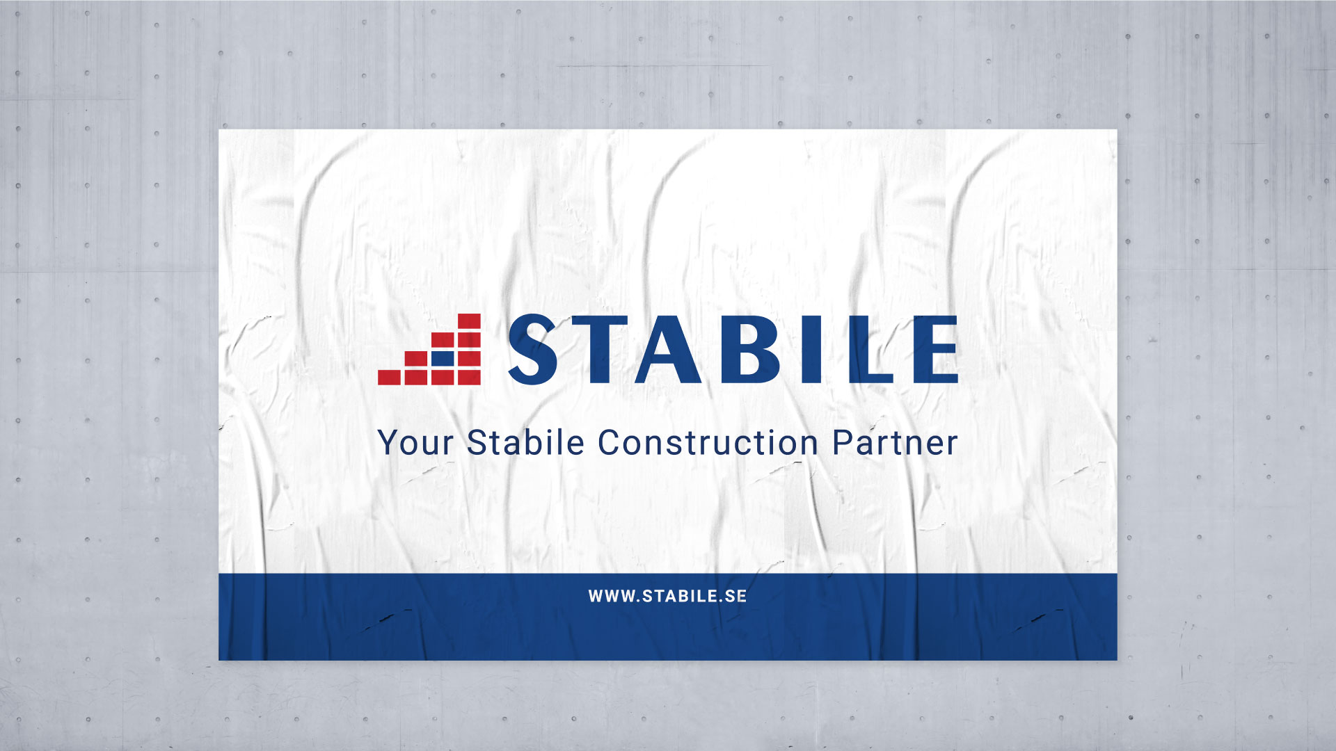
While working on a logotype, we’ve kept in mind that client comes from the construction business, so every little detail, such as squares in the logo, has its meaning. The main colors are also well-thought-out: blue symbolizes trust, while red stands for strength.
As always, we stand by a perfectly delivered design.
#graphic design #visualidentity #logo


