Every trademark must be properly introduced to its’ clients.
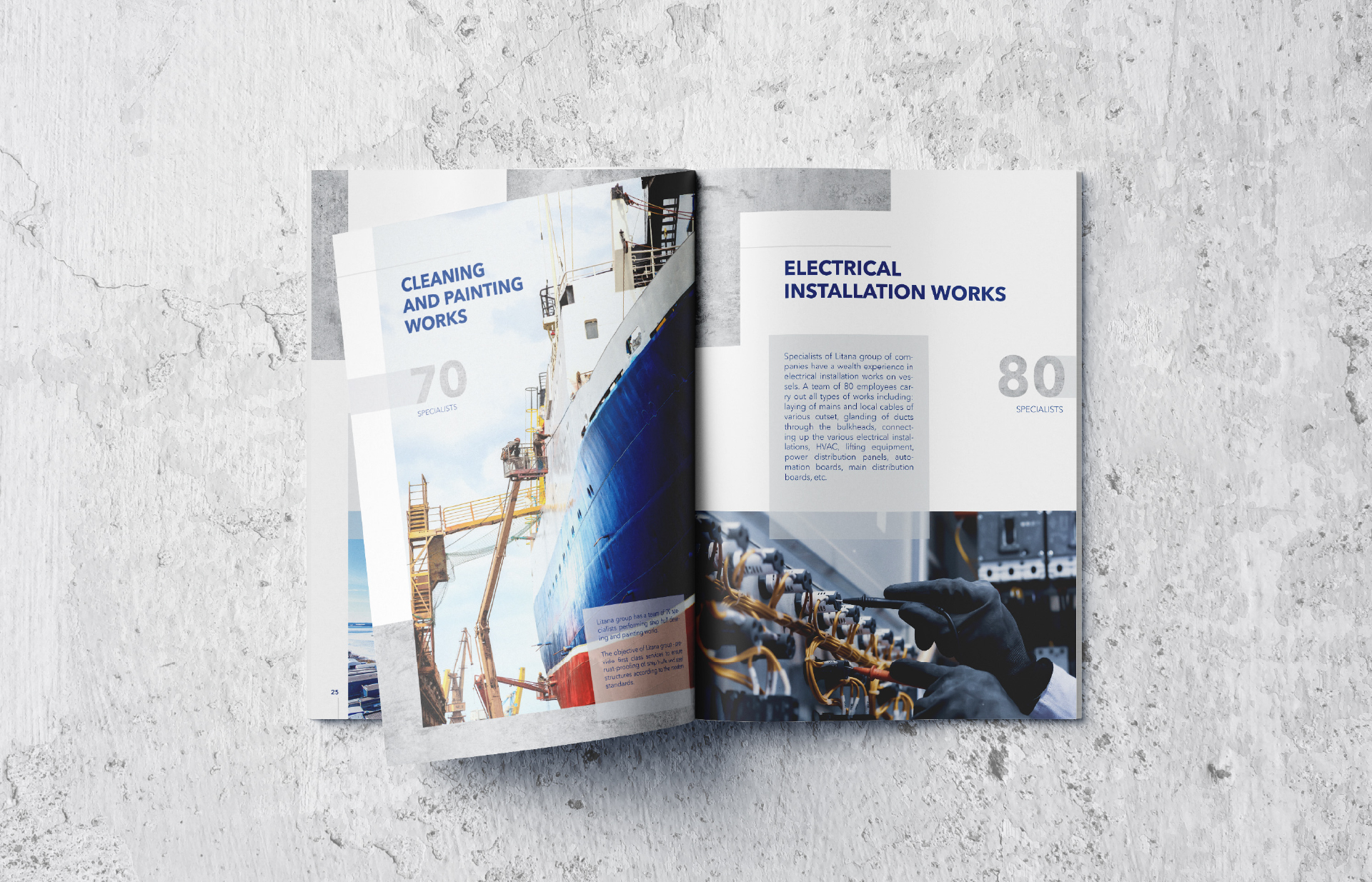
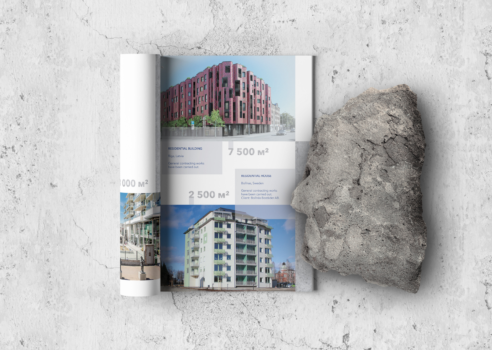
The following project shows it perfectly. Our team has developed a representational publication about construction and shipbuilding company LITANA. Seeking to introduce the company’s activities to its’ clients with emphasis on professionalism, we have applied specific visual identity solutions. Publication has a cool color palette, corresponding to the company’s identity scheme. The visual concept of “concrete structure”, used to present key facts as well as large graphic elements, highlights one of LITANA’s main activities – construction. Effectively chosen means and graphic elements have helped not only to create a solid presentation, but also develop a reliable as well as competitive company image.
#graphic design #visualidentity #logo