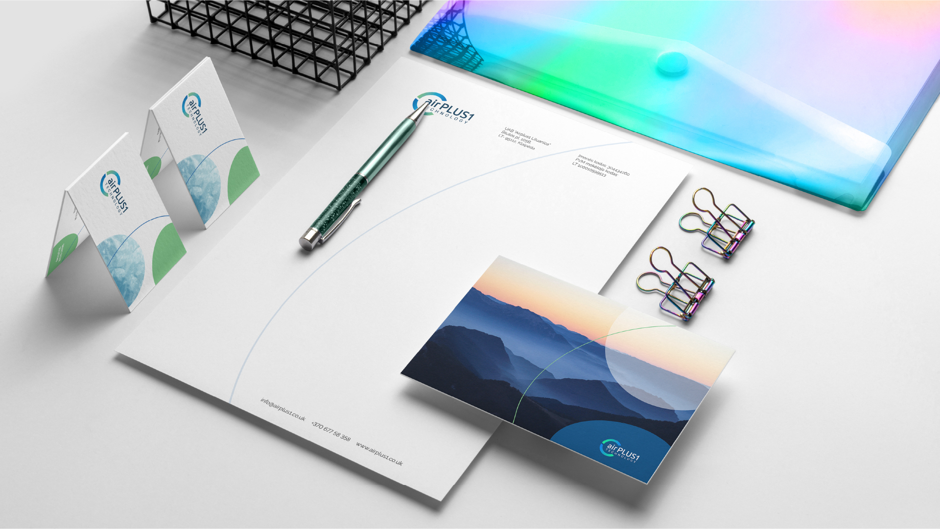
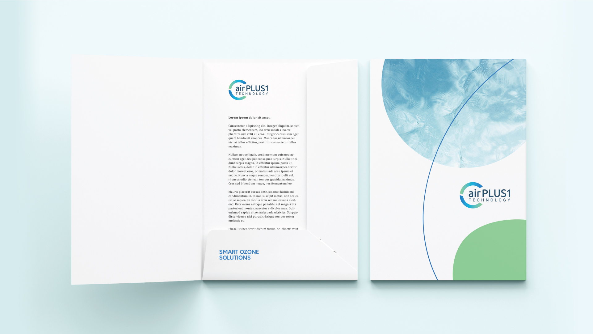
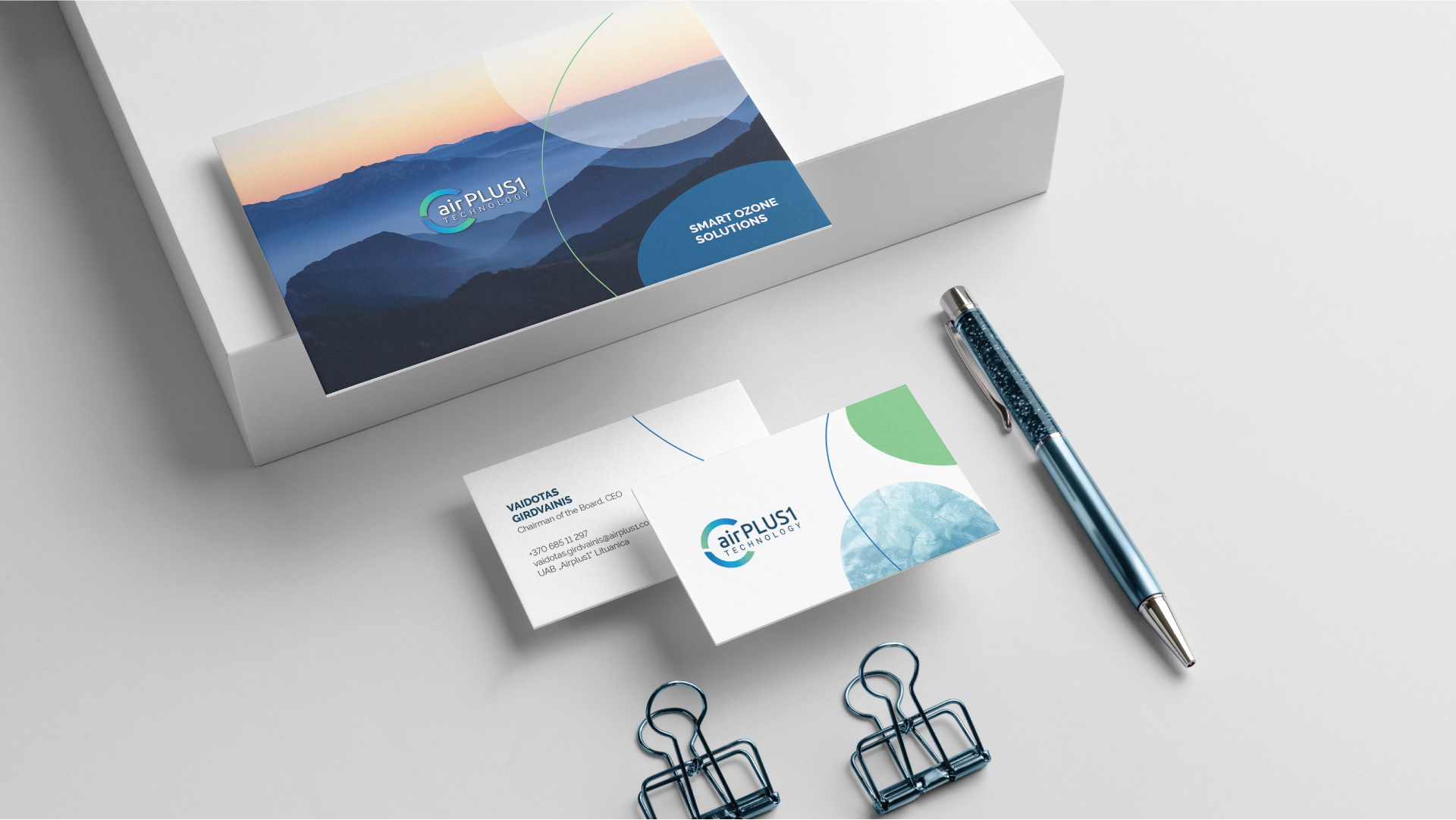
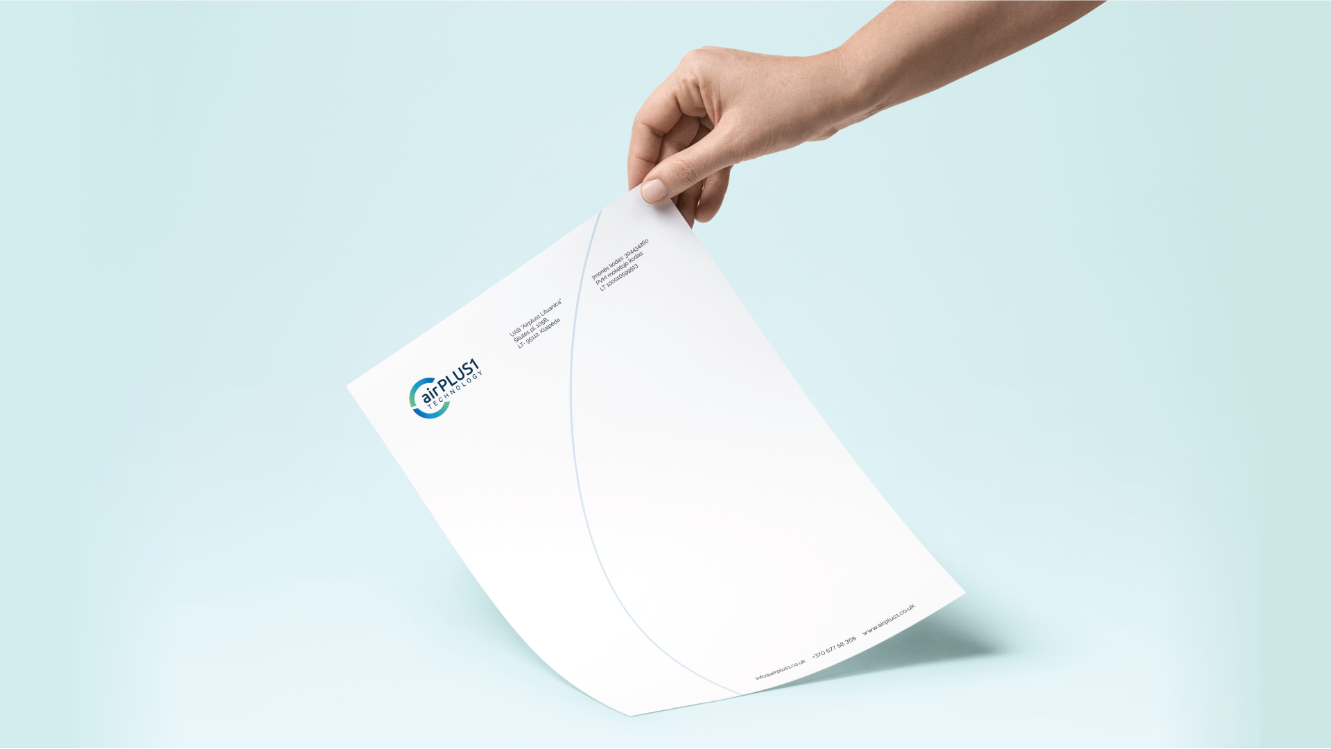
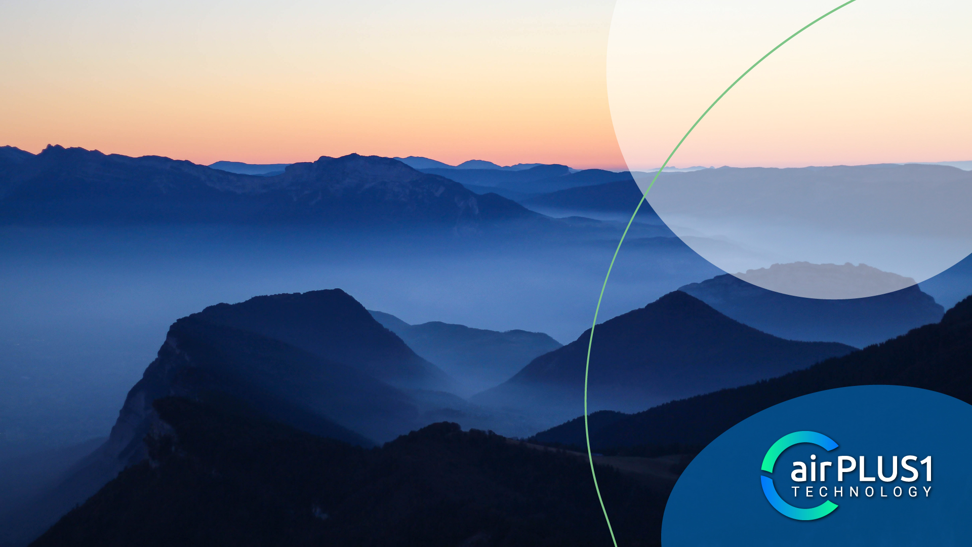
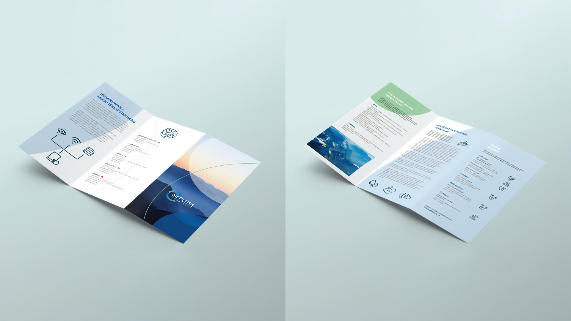
Sharing one of the latest team StandUp projects – AirPlus1 company’s logo redesign and visual brand identity creation.
With the new project we ALWAYS do our “homework“: what are the client’s main activities, unique services, techniques, materials, advantages. Then, we look for inspiration – textures, forms, meaning of colors, symbols, basically anything that would convey key and most important aspects. AirPlus1 offers patented smart solutions of ozone technologies. That’s why we aimed the logo to remind of air, its’ circulation, connections of molecules, dynamics, speed and freshness. At the same time, it had to convey the message about stable, quality service company, which employs the latest technologies and science inventions. This kind of harmony in logo was achieved through combination of strong and modern typeface as well as a gradient-colored round icon. Parts and elements of the logo reflect in all visual identity tools. Tones of blue and green connect it all together, symbolizing air, innovation, technological edge, reliability and quality.
#logo design #visualidentity


